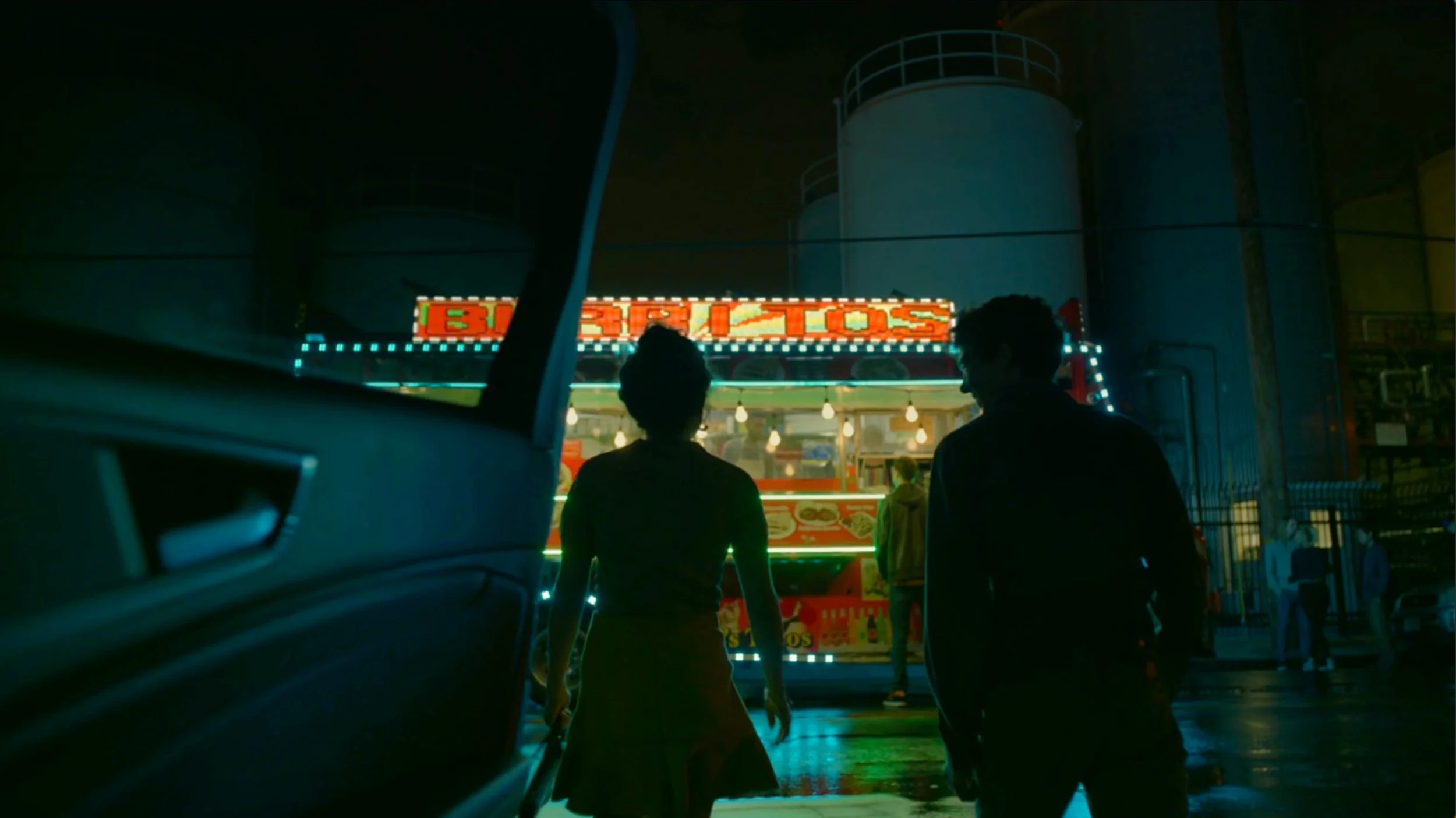
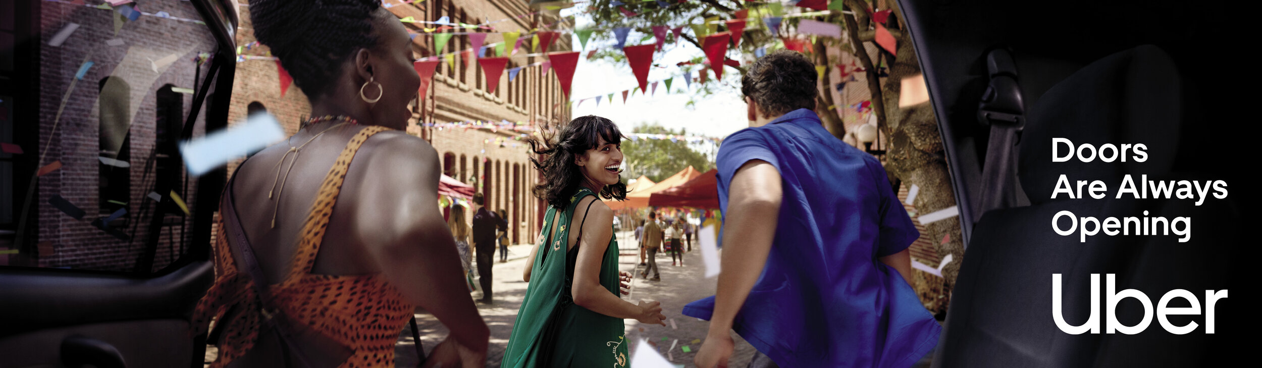
Doors Are Always Opening (Brand Revamp, Integrated Campaign)
Art Direction & Concept Development
For Uber’s North America relaunch we turned the brand into a symbol of living life to it’s fullest, positioning the service as a portal to opportunities. The process was inspired by crafting 140 character short “tweets” that become stories of people from all walks of life.


Micro Moments & Shorts


Print, OOH



First Sketch!
These low-fidelity sketches are what triggered the concept idea, becoming building blocks to the story as well as it’s look and feel for a national re-brand. Plus, some six million photos I took to avoid comping!


BTS posted without permission 🤗


